Biting the Apple
Dec 14, 2021 — Reyan Chaudhry
The Linux community usually has a lot of flak to toss at Apple for all of their product design decisions. I decided to take some time to find out how true these accusations really were.
Backstory
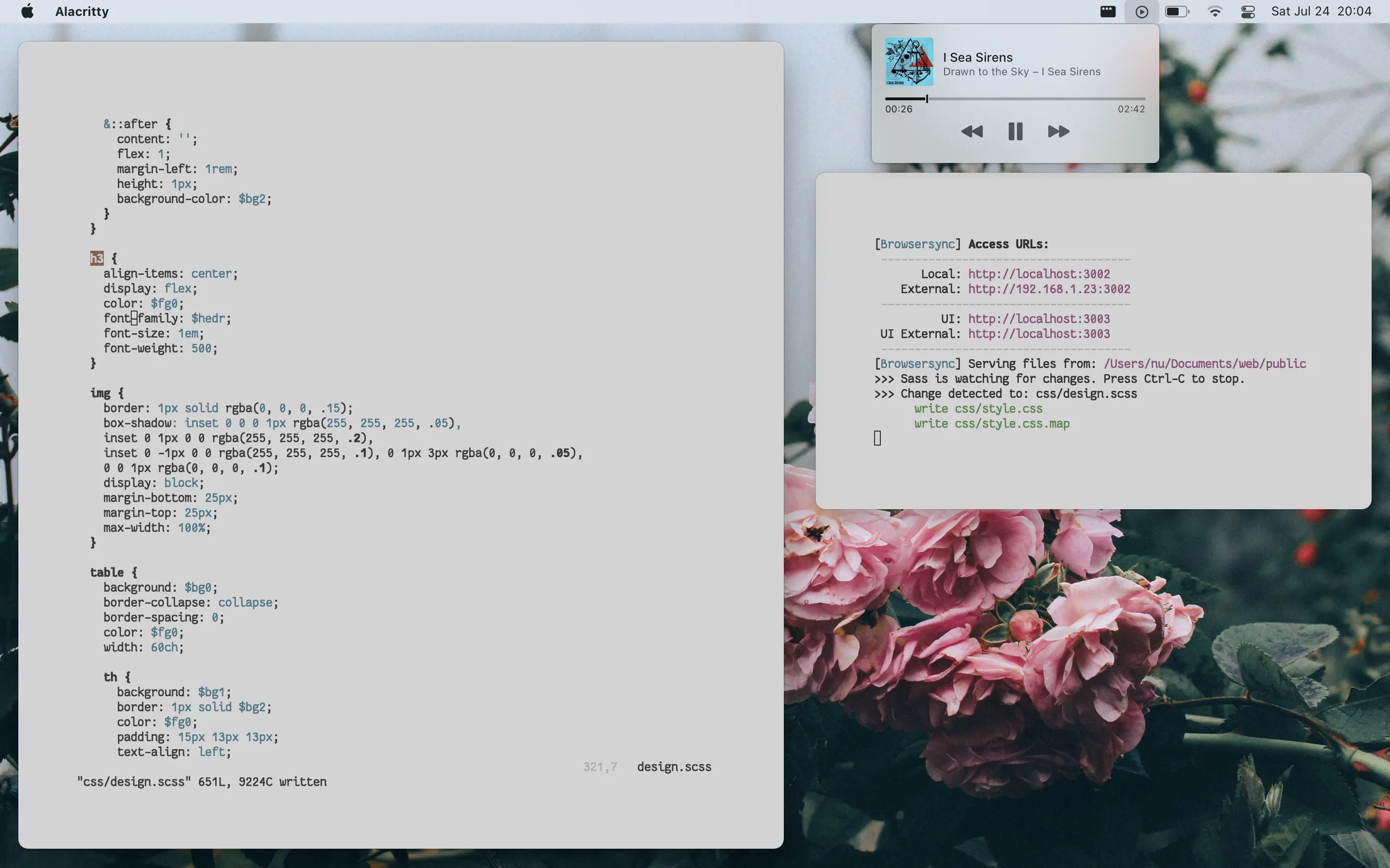
I was heading into university and needed a new laptop (plus other gear) anyway, and I had been hearing just about only good things from the new m1 MacBooks no matter where I went, except from Linux enthusiasts, of course; they were mad that the m1 didn’t support their tranny manjaro rices and thus proceeded to invalidate what is pretty much objectively the best value laptop of all time over terrible reasons. Now don’t get me wrong, there are some legitimate flaws with the m1 MacBooks, you just won’t hear about any of those from people who have never owned one before.
Initial Experiences
Around August I decided to purchase a base-model m1 MacBook air and take up my uncle on his offer for an iPhone XS, I ended up getting AirPods for free with the purchase of the MacBook so that sort of completed out the ecosystem for me (though I wasn’t as hyped about them as their sound quality isn’t exactly revered amongst audiophiles).
Being unfamiliar with macOS and coming from a heavily personalized Linux setup the first few weeks were sort of rough; I also had literally no idea how to use iOS and felt like a grandpa for way too long before eventually taking the time to familiarize myself with its UX (spoiler alert I now prefer it to android).
However, the absolute performance of the m1 blew me away at the time and even continues to do so, launching apps, running scripts, and working on assignments (IntelliJ actually being usable for the first time in my life almost made me cry) had never been more smooth. Not only that, but having literally 2 days of battery life was a life-changer for me, almost every laptop I had used beforehand barely lasted 5-7 hours on a charge—aside from the LG Gram which sucks in every other aspect so I won’t consider it—going down all the way to 2 if the workload got heavy; and as I found myself spending up to 13 hours on campus sometimes, having the battery life of the m1 always be there to back me up was a godsend.

A couple other nice perks of the Air include:
- Passive cooling (no fan noise!)
- Amazing speakers
- IMO best laptop screen for the $$$
- Meme-free keyboard
I would’ve liked having more than just two USB-C ports but alas Apple is Apple, I bought cables separately and just coped lmao, you get used to it after a while.
The continuity between the iPhone and the mac was also quite nice but nothing too exciting, for the most part the features I had implemented by hand when using Linux/Android (airdrop, file syncing) were available with better UI by default which saved some setup time. I wouldn’t call continuity a deal breaker though as my dumbass is completely fine with spending hours setting that stuff up manually. The only thing that I found actually useful was AirPods and how they would automatically connect when put in your ear, I swear I will never be able to use a normal pair of bluetooth earphones again after these. It doesn’t really make up for their sub-par sound quality but honestly if I really wanted that I would just pop on my pair of 6xx’s anyways and call it a day, it’s not a big deal.
The iPhone itself also quite surprised me, while iOS was a pain to get used to, everything else was fine, like, fine. That’s kind of the theme with iPhones for me personally, they don’t try and take better pictures of people of color like the pixel 6 or stuff you with 500000 useless apps and features like one certain korean phone brand, they give you a device that fucking works and doesn’t lag. I can’t stress that last point enough but the joke about iPhones being better because they don’t lag is spot on, you honestly never get tired of the experience.
In a weird way I find the iPhone to be exactly the embodiment of what I want in a phone, a minimalist UX that is still capable of letting me do everything I want without distracting me too much with customizability. It’s no Mudita Pure but it’s as close as a smartphone can get in my opinion.
MACK OH ESS
Let’s go deeper into the mud and discuss Apple’s Desktop Operating System™.
First Impressions and Muh Customization!
The first couple weeks with macOS were quite rough, not having all my trusty keyboard shortcuts or utilities set me back in terms of productivity quite a bit. But honestly once I let go of the habits I gained from Linux and actually started using macOS the way it’s meant to be, I felt myself getting back up to speed quite fast.
While it may not seem like it, you are actually still given quite a lot of room for customization on a mac, there’s just less of a visual aspect to it, which I don’t really mind since a year or so of countless ricing has taken that fire out of me for the most part. And for me personally, not having that headroom has actually ended up making me more productive as I’m no longer always worrying about customizing this or that.
I’m not the biggest fan of how macOS hides most of it’s best features behind 10 stack exchange articles and the deepest menu bar nests but I’m also not really complaining, once you know them you don’t really go back.

MacOS does have some pretty weird defaults if you are coming from Linux/Windows though (dock settings, scroll direction), so I’d recommend thoroughly going through system preferences on first boot before really starting to use your device.
Mac apps and the comforting illusion of quality
One of the most rewarding yet also frustrating parts of using macOS is the wide selection of apps to choose from. The Mac developer ecosystem varies quite a bit from that of Linux and is what I feel the main main differentiating factor between the two ideologies. While on Linux you are treated with an almost endless stream of free and open source apps/utilities you are sort of left on your own to decide between them and do maintenance. I personally really enjoyed this aspect of Linux but will admit it did come with its frustrations from time to time.
On Mac, however, the scene is a little different. While you still have quite a bit of FOSS apps there is a lot less emphasis on the command line and more so on functional GUI apps, which switches up the dynamic quite a bit. Most developers do charge for their apps (even some arguably very basic ones) but can get away with it since the “quality” of apps on Mac are usually of a much higher magnitude than on Linux; thing just work and the overall experience is just better. Furthermore if you don’t feel like paying the OS X pirating community is fucking amazing so you can pretty much get whatever you want for free.
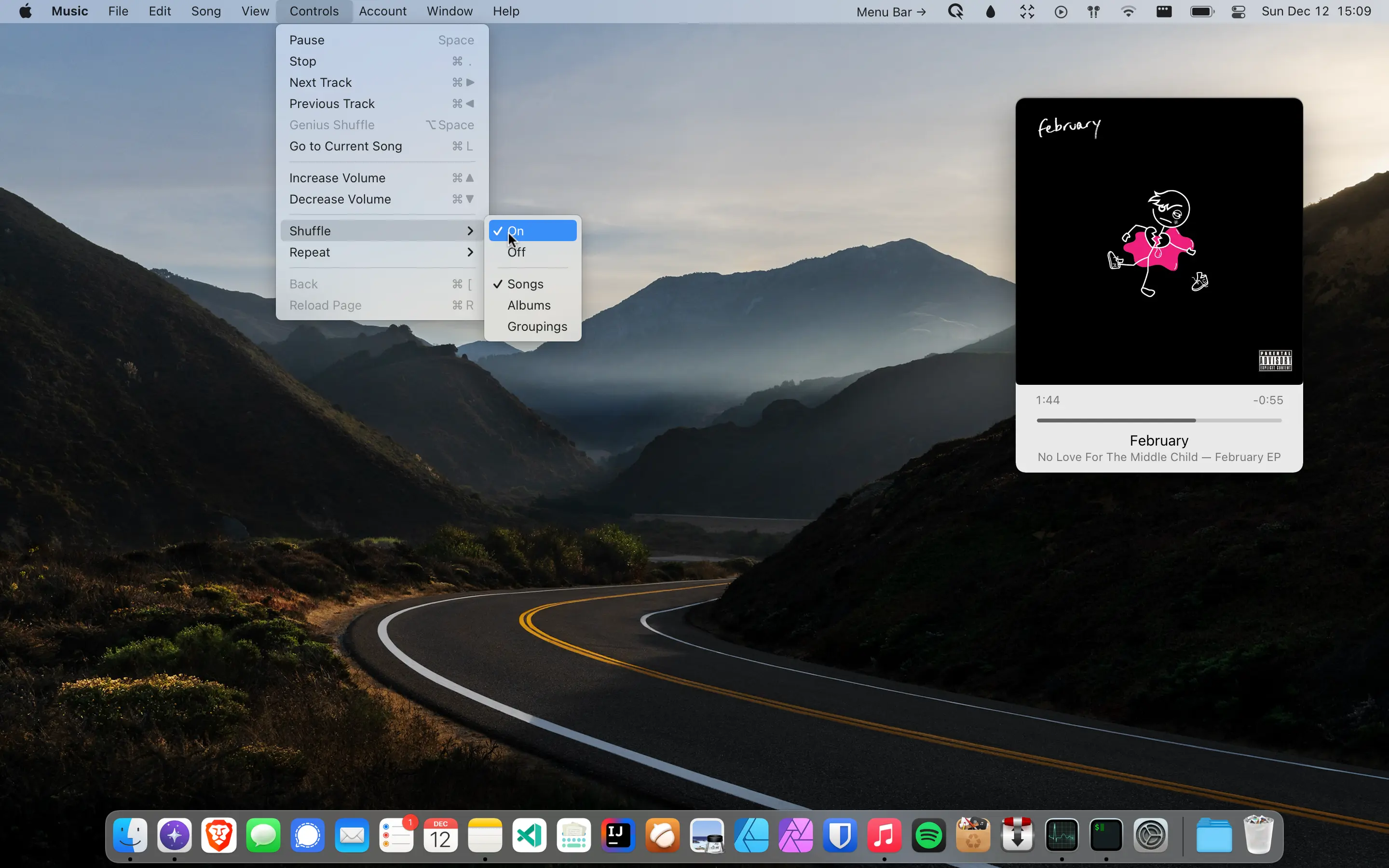
A lot of my new favourite softwares are actually turning out to be some of these mac apps, to the point where I've actually dedicated an entire section of my softwares page to them!
The fact that this list turned out to be way longer than I had originally thought it would is I believe a perfect testament to the quality of the mac app ecosystem. I’ve made sure to keep the list limited to actually well written native applications, unlike Windows, macOS hasn’t been completely overridden with an influx of shit quality electron apps, low ram usages and actually usable UIs are thankfully abundant here. While a lot of these do cost a bit, I would be perfectly fine with paying for them if I had the money, that’s how good they are.
But then again, why join the navy when you can be a pirate?
“Dark” Side
Not everything is unicorns and rainbows when it comes to the mac, however, as with anything else relating to technology, there were some subpar aspects.
First and foremost, the privacy concerns, while you can (mostly) castrate iCloud and turn of location settings and the like, it’s pretty well known that Big Sur+ macs do some sus things in the background. However I’ve honestly stopped over-stressing about privacy related things—especially since Apple is decent in that regard—as you can only go so far before sacrificing considerably in terms of both dignity and usability.
The OS also sometimes doesn’t seem to be the most power-user friendly. For
example, why is there a function key reserved for spotlight when we have
the cmd+space keyboard shortcut everyone knows about, same
goes for the mission control button, those keys could be used for much
better purposes. The default dock configuration is just plain stupid on a
13” screen, and having no option to at least slightly reduce some
of the excessive padding in UI elements on the smaller screen is sort of
idiotic (especially since quite a few apps do seem to be
optimized for that).
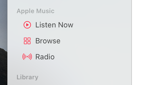
I’m also not the biggest fan of the newest update to Music, why take away the option to hide Apple Music from the app? I’ve used is as my local library manager for a while but accidentally pressing “Listen Now” and triggering the streaming service will force my hand sooner or later, which is unfortunate since I can’t really find a better native music player as of yet. Some other problems include (but definitely aren’t limited to):
- The infamous Monterey memory leak
- The hide vs. minimize vs. close debate
- No proper EQ software (boom 3d garbage doesn’t count)
- Installing apps could be less annoying (Some apps do have a cleanup functions in their installers, but 99% don’t and it gets really annoying after a while )
- Meh default window manager
MacOS obviously isn’t perfect, but I wouldn’t definitively say that it is a worse experience overall than Linux; in general I think it’s fair to consider it a nice middle ground between the “just werks” role of Windows and the complete FFA that is the *nix ecosystem.
It really just gets the job done and for that I can respect it.
Shot on iPhone, shoot my iPhone
I’d personally say that the iPhone experience has been the most hectic for me, especially since a lot of my “expertise” lies with desktop OS’es and not those on mobile; I needed a phone however and thus learning was my only way out.
If the problem of hiding usability hacks from the user is present in macOS, it is multiplied tenfold on iOS, with there being almost no indication of how to do certain things around the operating system: moving icons on the homescreen, switching apps, copy-pasting, and even managing widgets are all positively frustrating tasks until you find that one little gesture or action that immediately makes it way easier and you never have to worry about it again.
Before those “aha” moments, however, iOS isn’t really too special, after them it becomes a joy to use though. The UX designers at apple have really thought all the way through the mobile experience and you can tell that this is where the majority of their design resources go, not towards the slightly rough edged macOS.
One proof of this is the safari redesign, while almost unanimously disliked at first on the desktop, it has been absolutely revolutionary on iPhones, making browsing the web on my phone not as headache inducing as it usually is.
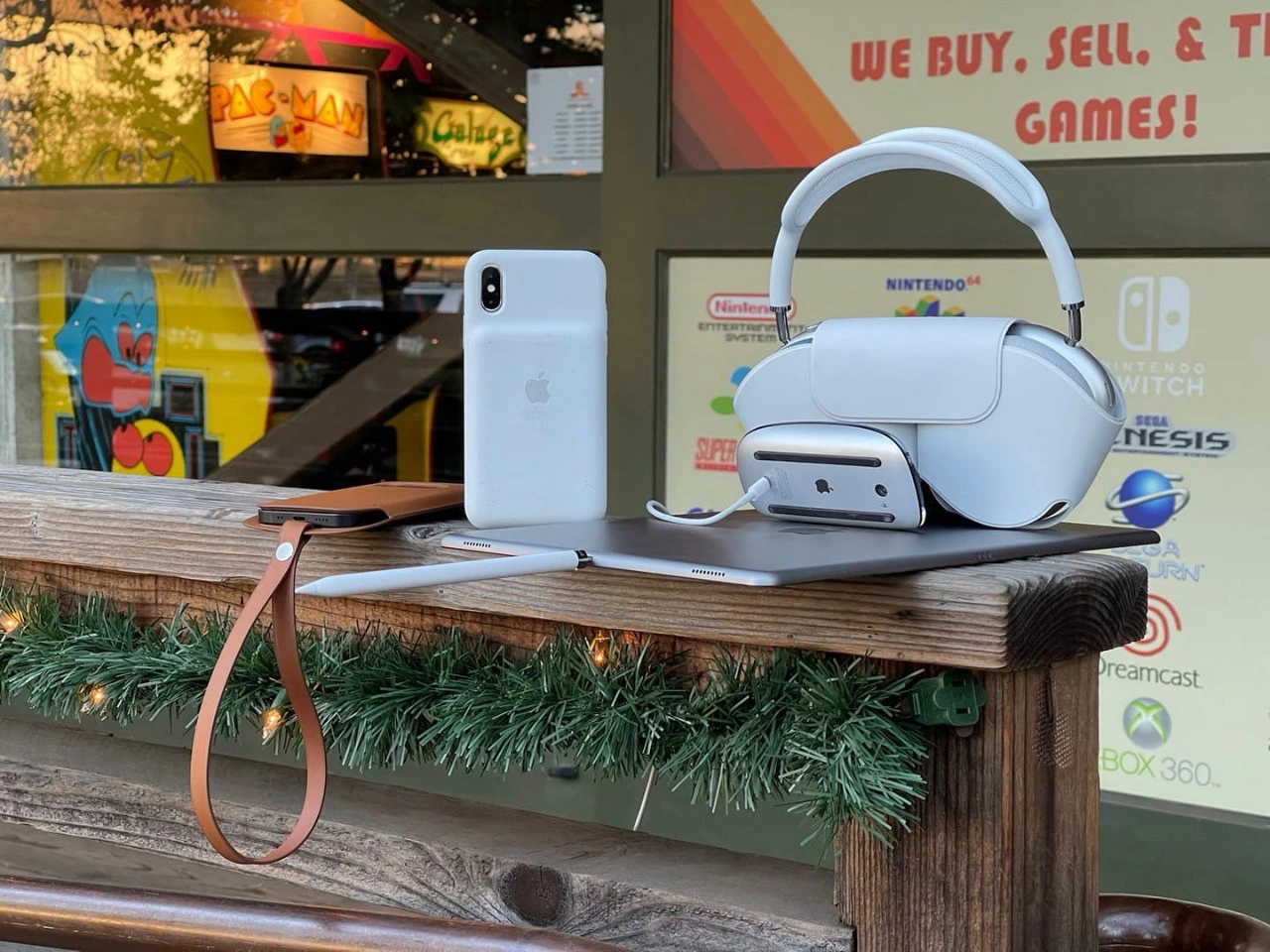
However, after using the phones (an XS and now a 13 mini), you soon come to realize that a lot of what makes iOS feel so “perfect” actually comes from it’s extremely locked down nature: you don’t even have access to the filesystem and the settings are very picky about what you can and can’t change. It’s enough for now but you never know how much worse it could get in the future.
I will give apple credit though, they are the only phone manufacturer whose 4-5 year old phones are still perfectly usable today. I had the chance to test both an iPhone X and a Samsung Galaxy S9+ side by side after my XS fell on concrete (long story), and the difference between the 2 was shocking. The S9 felt laggy in comparison and had picked up quite the screen burn-in over the years. While the X felt almost indistinguishable in terms of smoothness from any other iPhone I had used, even on the latest iOS.
Had I written this article a few weeks earlier, my main complaint with iPhones would’ve been their battery life, but using the 13 mini (which is the worst battery of the 13 series!) on a daily basis destroys that argument too: it easily lasts 36 hours for me. Older phones (8, X, XS etc.) which have picked up considerable battery wear, however, usually lag behind in screen time compared to newer androids, so I’d look out for that if you wanted to buy used.
I could go on about camera/screen quality and design and whatnot, but I’m sure everyone knows about that already, it’s an iPhone, it gets the job done and gets in your way a surprisingly small amount. For someone who has very limited use for his phone, I find Apple’s offering to be close to perfect, more control and sideloading support would be nice but once again, Apple will be Apple, we can’t ask for too much.
How it be
I feel like you get the idea by now, Apple products aren’t as bad as people make them out to be if you are willing to get a little invested into the ecosystem, and I haven’t even begun talking about the nostalgic iPod scene or the absolute wondrous experience that is dealing with retro macintoshes. There’s a lot more polish and a sense of true history when it comes to dealing with the way Apple does things, and I can respect that a lot.
Hopefully Mr. Cook retires soon and a real man like Federighi can take charge of the company, fix some of it’s software inconsistencies and stop caring about the opinions of normies. If that happens, FOSStards may have something to fear yet again after the fall of Microsoft. I hope this was an interesting read—definitely a fresh take for the usual audience of this blog—but it shows that even someone as stubborn as me can embrace change here and there.